Kallidus design principles
Company
Kallidus are a B2B SaaS provider in the HR and Learning & Development space, that aim to unleash the potential in people through the use of their recruitment, learning and performance software.
My role
Lead UX designer
The team
Working alongside the UI designer
Key responsibilities
This was a joint project with the UI designer
The challenge
When joining Kallidus there were no documented design principles to work from, which meant there was nothing to align the UX design work to, to ensure we were headed in the right direction for our products and business.
When looking at the suite of products it was clear they had been designed and built at different times, by different people. This had led to inconsistent design solutions to common user needs across the suite of products.
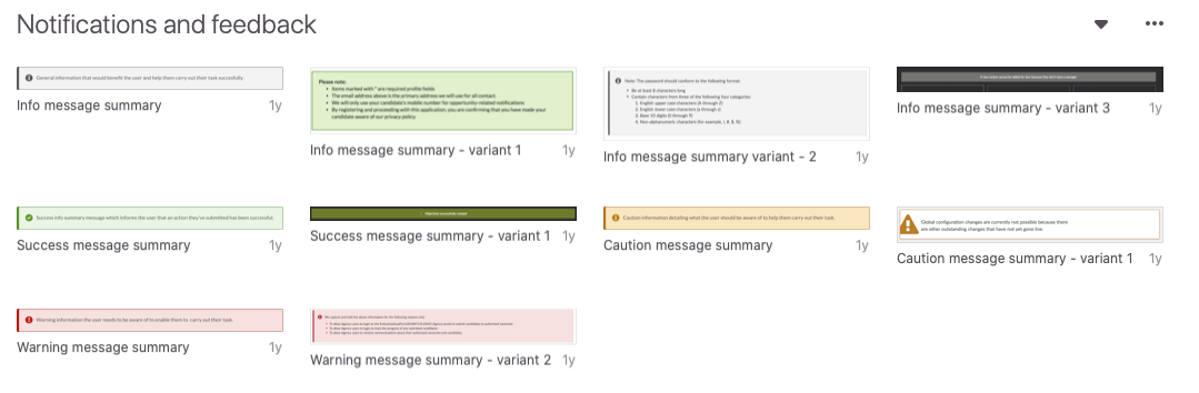
Variation of notification messaging across the Kallidus suite
The project goals
To create a set of design principles that are aligned to the Kallidus brand framework. These design principles would help us make design decisions and trade-offs.
Approach
We wanted our design principles to:
- Align us with our business values
- Help us with decision making, informing our design approaches
- Help create a consistent user experience
- Enable efficient development
- Help inform our product testing strategy
- Help us with onboarding
- Provide us with the flexibility to evolve
In order to ensure it aligned with the business, its values and brand framework we needed to get involvement from the senior management team. We also needed input from the wider technology team to ensure they were bought into them to they would be used.
We created our design principles through a series of collaborative workshops.
Summary of steps:
Initial technology design principles workshop
Our first collaborative session saw us facilitating an open workshop for the whole of the technology department. I facilitated this with the majority joining in person in a meeting room, while some Bulgarian colleagues joined over conference call.
We ran a post-it note exercise, giving everyone a stack of post-it notes and for 3 minutes asking them to note down words that they felt resonated, or should resonate with Kallidus and our products.
We collected post-it notes by taking it in turns around the room to put forward their words, and providing a brief explanation. During which I collected the notes on a Flipchart and started categorising. We also saw two segments emerging for words we wanted to move towards, and words we wanted to move away from.
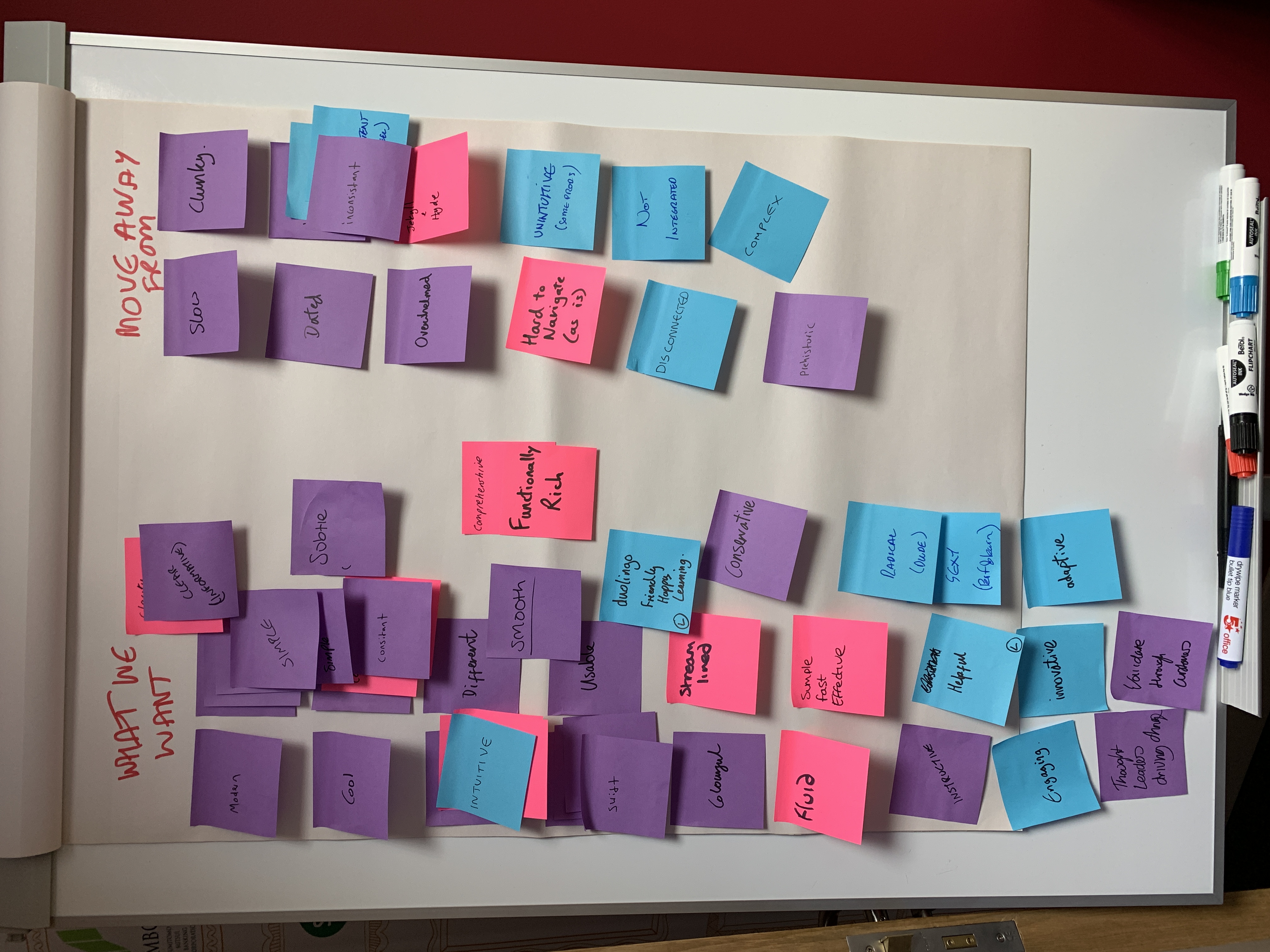
Following this session we noted down the main themes that emerged.
Draft design principles pulled together
In a session between myself and the UI designer, using the themes from the developer workshop we documented what we felt should be our initial draft of the design principles. We also encapsulated a short description of each, again based on the conversations that evolved in the technology workshop.
During this process we had any existing Kallidus brand statements available e.g. our vision and product visions, to ensure we were remaining aligned.
These draft design principles were iterated on in informal sessions with the product owners.
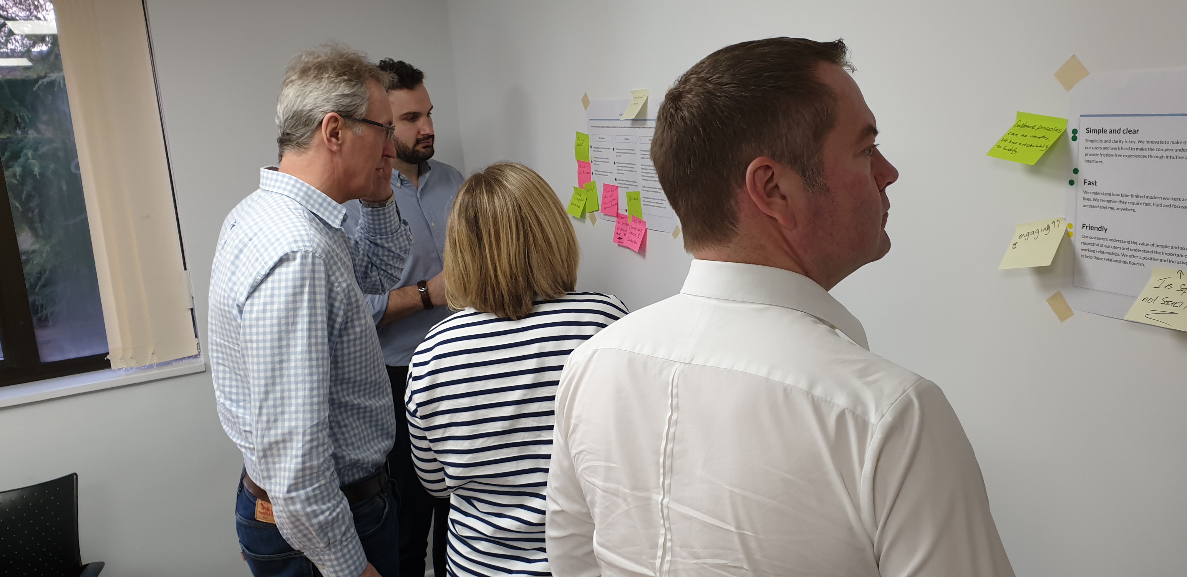
Senior management team workshop
To ensure we were aligned across the business we invited key stakeholders from across the business to feedback, including the CEO, CRO, Head of New Business and Head of Marketing.
We ran this session as an interactive Art Gallery workshop, by placing our draft design principles on the wall alongside current versions of the Kallidus vision and product visions. We gave each participant a stack of green dots, yellow dots and red dots and asked them to place green next to things they liked, yellow next to things they weren’t sure about, and red next to things they didn’t agree with.
Following a 20 minute dot voting exercise, we discussed as a group the main cluster of dots to understand the feedback.
Taking the feedback and insights from this session we were able to revise the design principles to something everyone was happy with.
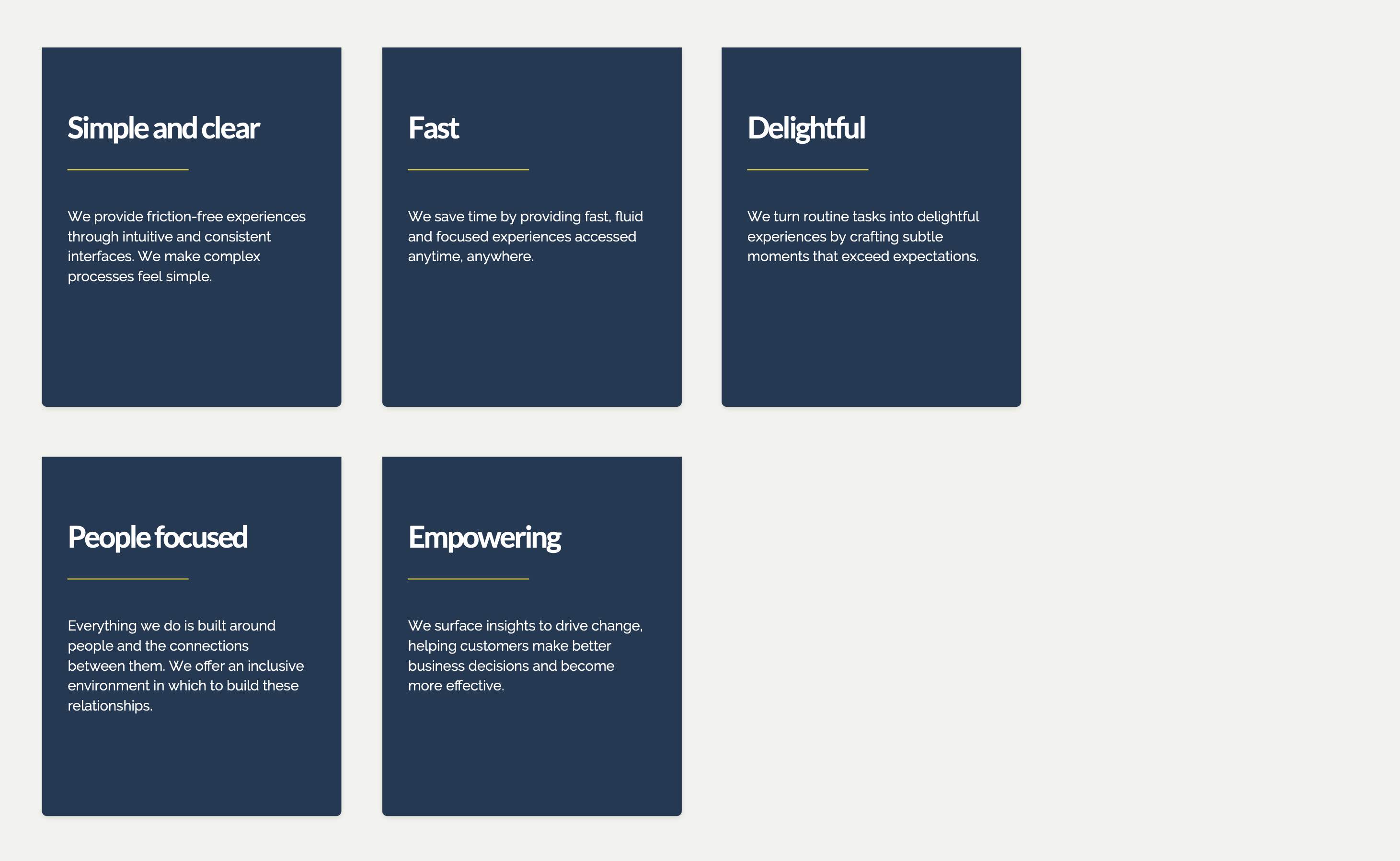
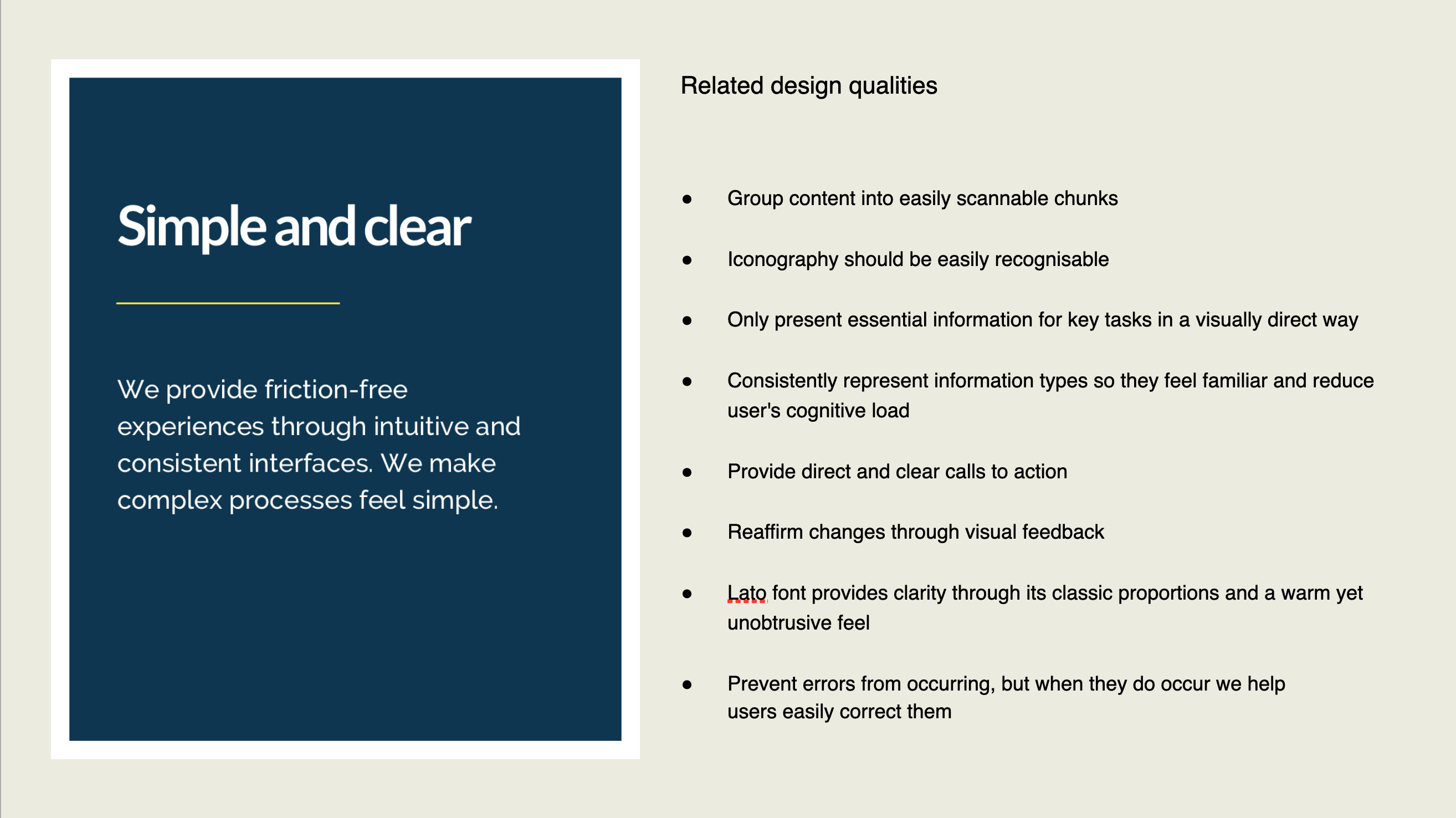
Design qualities
The next step was to articulate how the design principles should manifest within our products.
Design qualities can help designers identify tangible qualities that will enable us to deliver consistent design solutions aligned to our principles.
We ran a workshop within the UX design team (we now had another UX designer on the team), where we audited our current products and brought along screenshots or videos of where we felt we were meeting our design principles. This helped us understand the underlying qualities which were helping us meet the principles. As everyone was sharing the ideas we were capturing notes on post-its.
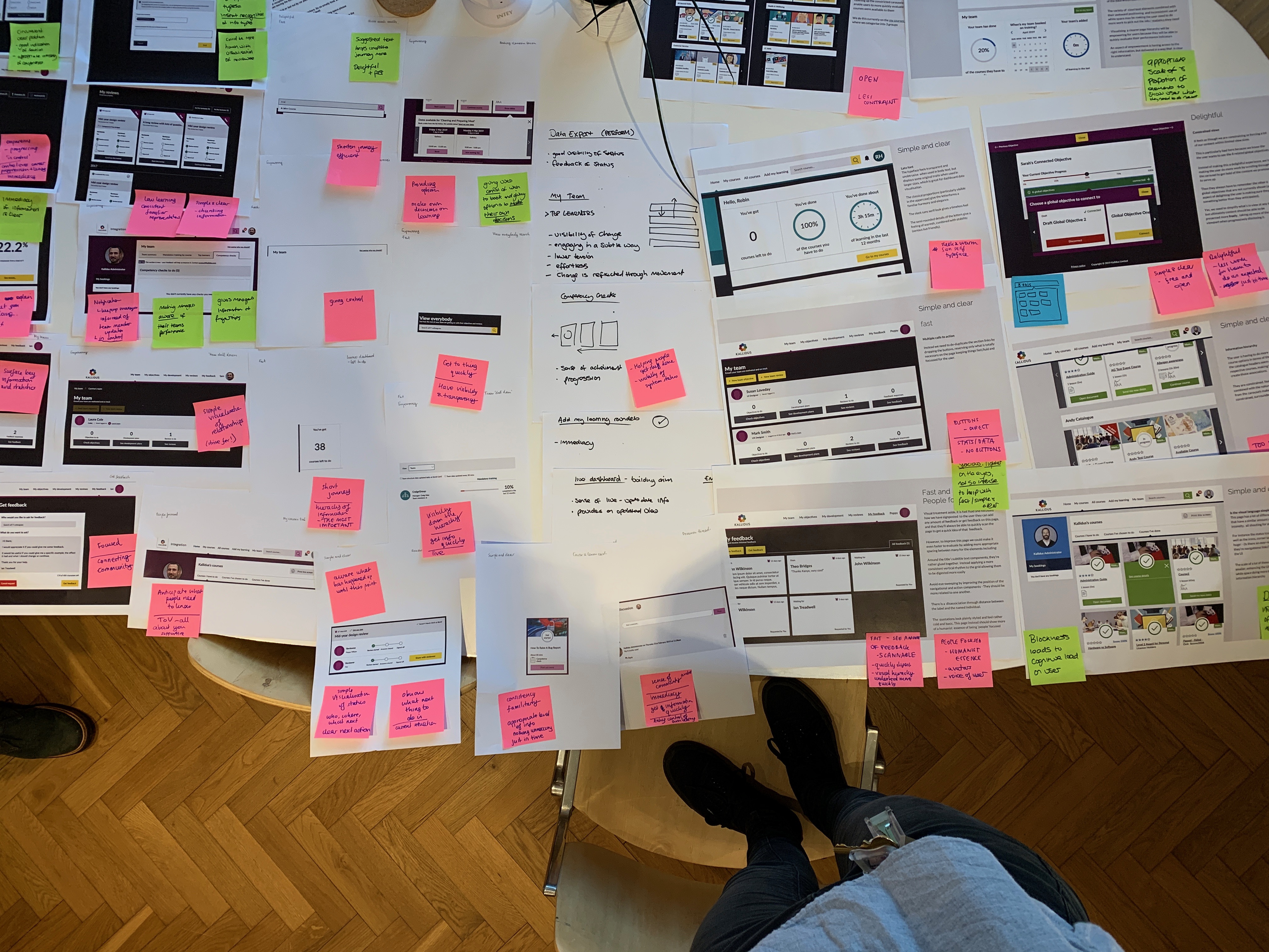
We iterated on these and eventually compiled a list of short quality statements that would sit against each design principle.
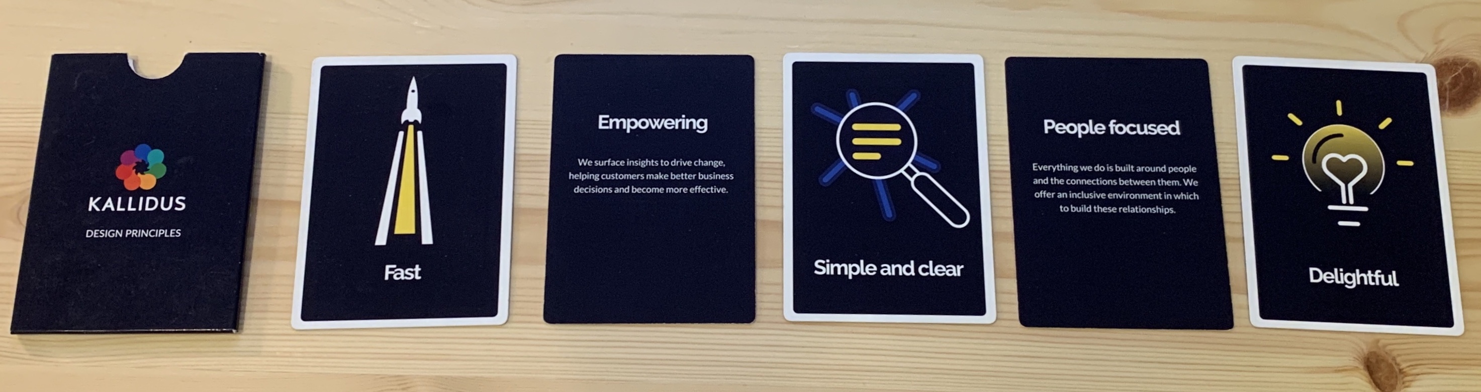
Creating design principle assets
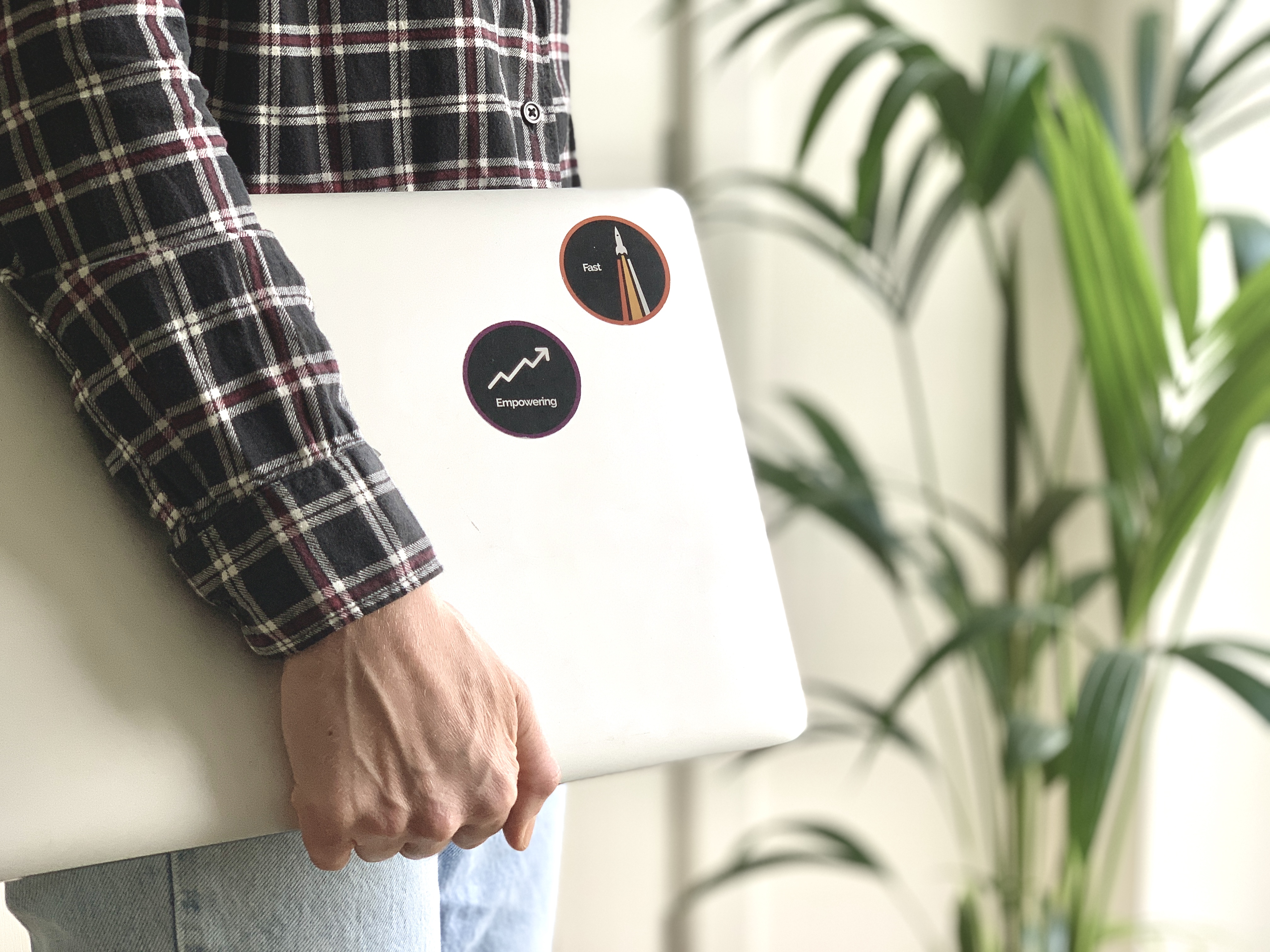
Since part of the goals for the project were around education, both for people in the business, and specifically for us as a team including onboarding new designers, we wanted to create some physical assets with the design principles on.
We decided to create a set of cards and stickers that people could have on their desks and use when making design decisions.
In order to create these we needed to agree how these would be visualised.
We ran a workshop which first saw us doing lightening demos on examples in the wild we had seen and liked. We captured key ideas from these on a Flipchart so we could consider these in our later work.
We then conducted a 6-up activity where we were rapidly sketching ideas for each principle, using a Time Timer to keep the pace up.
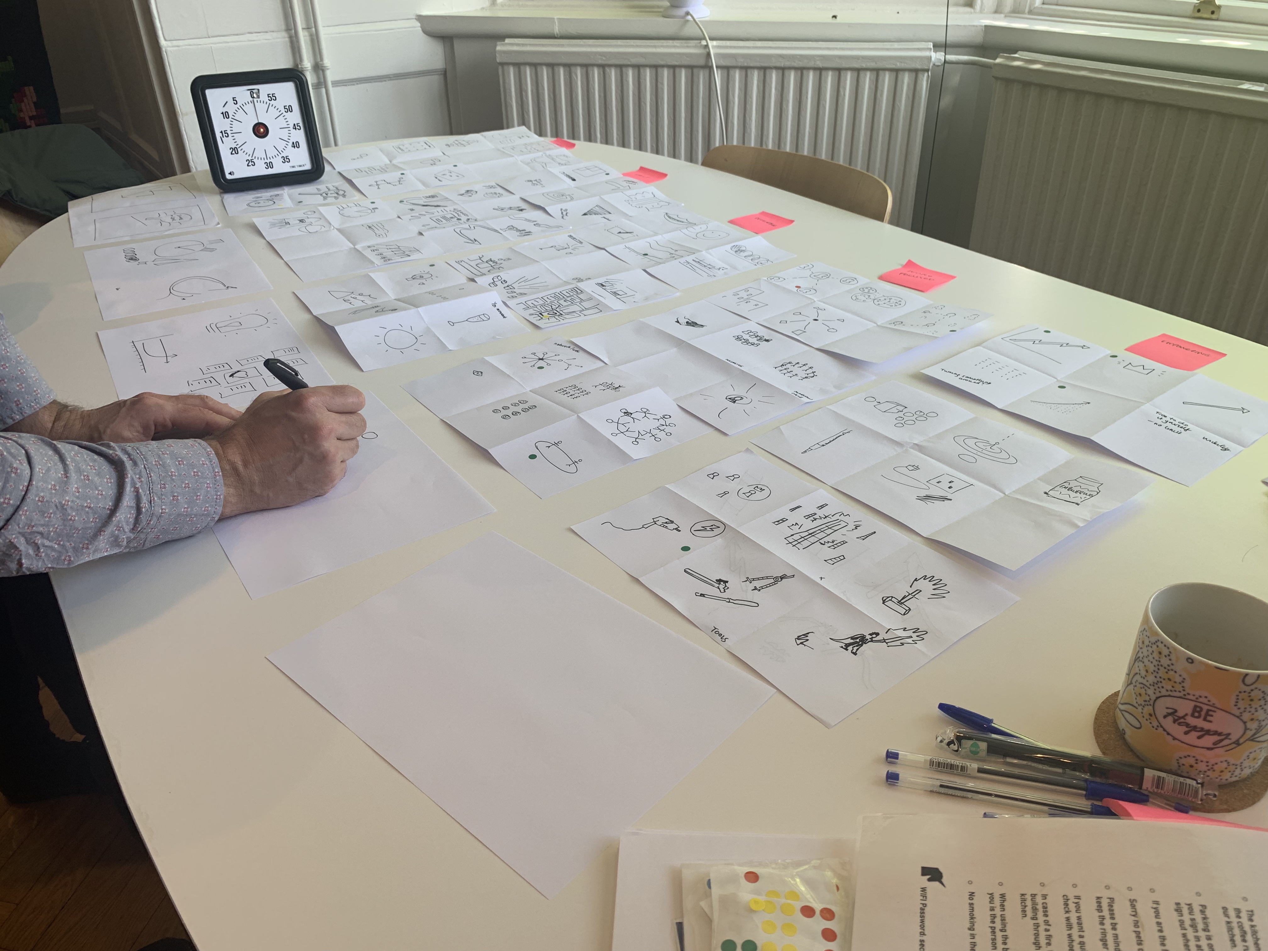
We discussed ideas and consolidated down to a theme we were happy with for each. This then went into more visual design work by our UI designer outside of the workshop to eventually create our cards and stickers.
Perception testing
We want to ensure our products are meeting or moving towards these design principles. We do this by including a perception test in most of the user testing sessions we run.
Using our design principles we created a word grid which contained words that aligned to the design principles, words which were the opposite, and neutral words we were not interested in achieving.
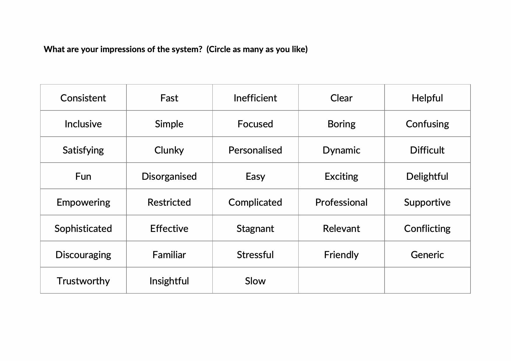
At the beginning of each testing session we ask the participant to circle as many words as they like, that they feel resonate with their perception of the current Kallidus products they use.
At the end of the testing session we ask the user participant to circle as many words as they like, that they feel resonate with their perception of the prototype/system they have just been using.
This helps us understand whether the designs we are testing are helping us align to the principles.
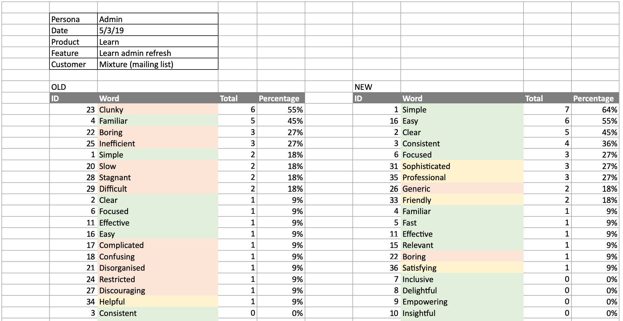
For example, having run some user testing on an updated admin interface for our Learn product we got the following results. It was clear that we were aligning more to our design principles (green words), and less of the negative words (red words) in the new design.
Conclusion
Our design principles are in active use and help our growing UX design team on a day-to-day basis making design decisions, and testing our designs with real users.
The design principles are also widely known around the business, and spark healthy debate.