Lloyd's Register IDS
My role
UX designer
The team
I worked alongside a team including another UX designer, lead UX designer, business analysts, visual designers, solution architects and developers.
My responsibilities:
- ownership of one stream of UX design
- facilitation of workshops to uncover requirements
- facilitation of collaborative design workshops
- production of detailed wireframes
- production of logic and data flows
- collaboration with other UX stream to ensure consistency and cohesion
The challenge
Lloyds Register had multiple disparate systems that were used internally across the business to manage surveys and audits carried out on ships to certify them for sailing. These ran on old technology and had a limited and decreasing knowledge base of how these systems were run and worked. There was an opportunity to improve ways of working, and mitigate these areas of risk. The usability and user experience of these systems was very poor.
The project goals
Lloyds Register wanted to consolidate these systems, providing a more efficient, effective and satisfying experience for the users. We were tasked with designing an MVP (minimum viable product) desktop application to manage the certification of ships, that would pave the way for Lloyd Register’s digital transformation. The application should have an improved usability and user experience to the existing solution.
Approach
The approach that we took followed a User Centered Design methodology, which was reinforced by the opportunity for us to work alongside previous surveyors, auditors and back office workers who all were key users in the application we were designing. These ‘proxy users’ (we called them Business Leads and Subject Matter Experts) were available to us throughout the user research and design phases, allowing us to continually test and revise our hypotheses.
The desktop nature of the application was always kept in mind, from navigation, page layout, and interactions to the visual design. However, we were also keen to future-proof where possible, so, for example, although the minimum screen pixel size was 1024 x 768, we designed for responsiveness and touch devices, ensuring buttons were a suitable size for touch.
While the workflow application was complex, we aimed to ensure clarity and reduce ambiguity as much as possible.
User research
Prior to joining the project, user research was carried out by the existing UX team, including a heuristic evaluation (based on Don Norman’s 10 UX principles) of existing designs of the system. This allowed the team to share understanding with the business of where improvements could be made, and to build trust and understanding of UX principles with the client.
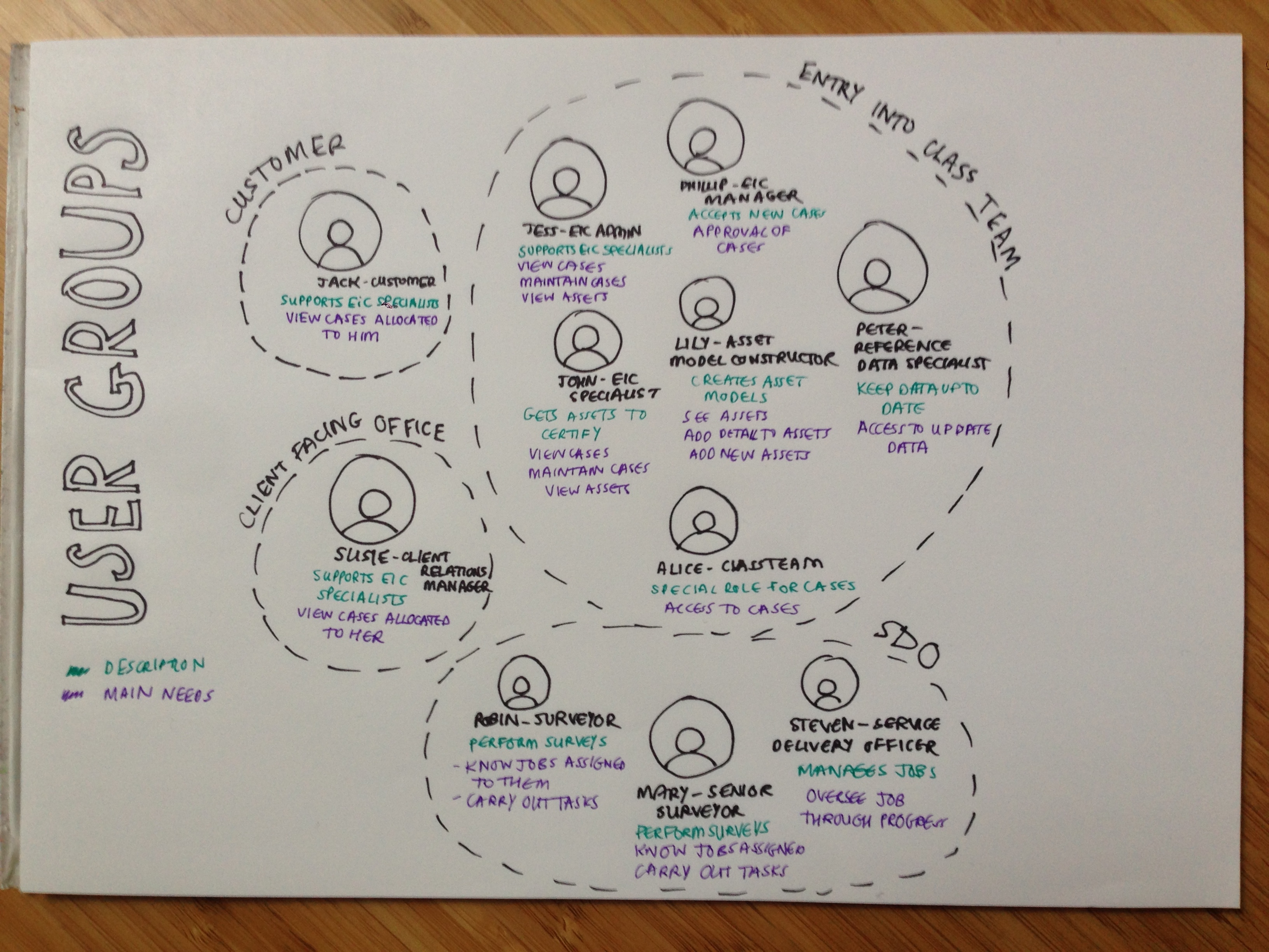
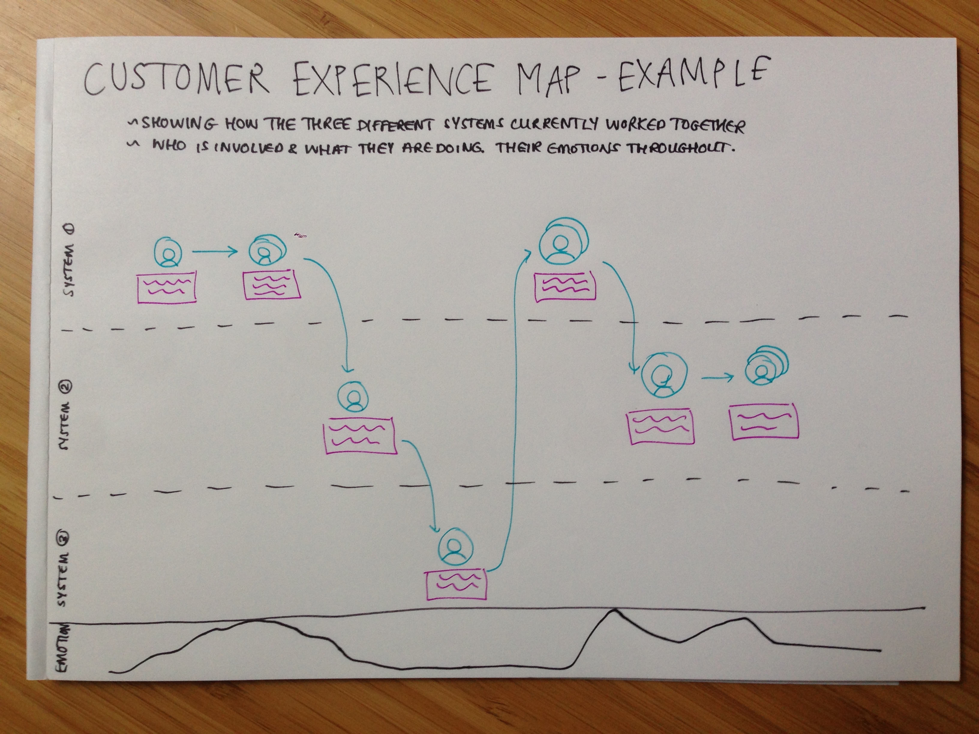
The business analysts were able to provide the UX team with an ‘as-is’ user journey which was then translated into a customer experience map. This allowed us to see how the separate systems complemented each other, and what opportunities we had from a UX perspective when bringing them together under one application. It also allowed us to see where the different user groups overlapped in their jobs, and equally, where they did not.
Information architecture
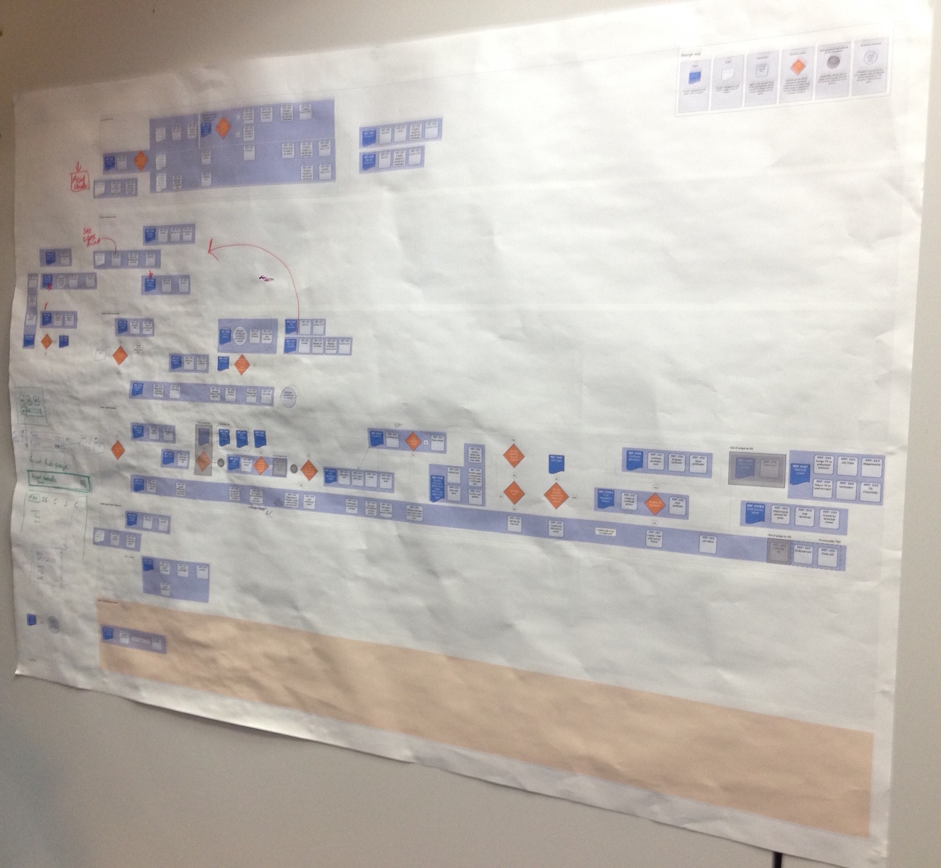
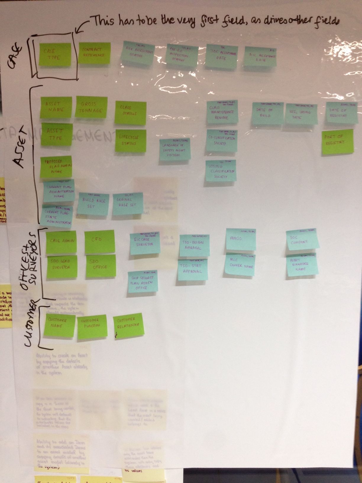
Taking the user requirements and functional requirements for the release of the application, a high level information architecture was sketched out in the form of a site map. This identified pages and modules that would need to be designed.
Business lead workshops, user journeys and wireframing
The design of the pages and modules happened on a feature by feature basis. My workflow when working on each feature was:
-
Analyse requirements with the business leads in order to get a deeper understanding of the user and functional requirements and uncover the reasons for these;
-
Understand the current workflow to uncover opportunities for improvement as well as key content which users were accustomed to;
-
Build user journeys pertinent to those users who would be involved in this feature;
-
Sketch out the pages and modules with these journeys in mind to understand the screen flow that would take place for each user group;
-
Increase the fidelity of sketches and produce wireframes of each page and module.
This was done while consulting the business leads at each stage in the process to keep on track with what the user really needed, and to ensure that what was being designed made sense to them.

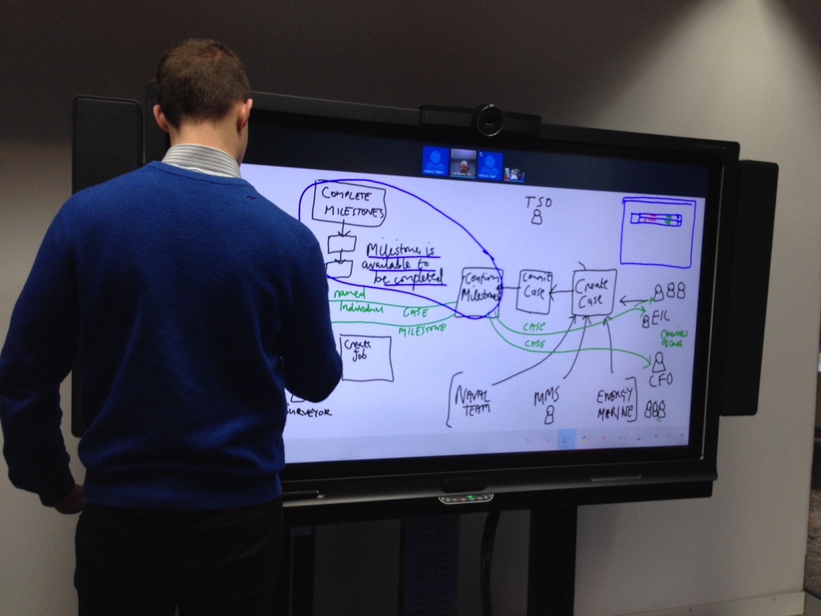
Collaboration
We worked closely with visual designers, business analysts, solution architects and developers throughout the whole of the process, which allowed us to identify issues and risks early, allowing resolution with minimum impact.
An example of this relates to questions around data integrity, and how this would be managed and maintained. This point arose during UX workshops, and was then handled by the technical team. We had to find a solution that allowed the database to easily manage the data integrity, while still providing the user with the functionality they needed to carry out their tasks effectively.
This collaboration also helped us to stay on track for producing an MVP, as this was in everyone’s interest.
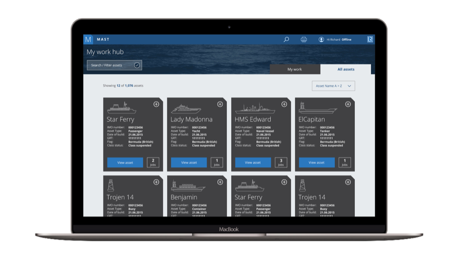
Lloyd’s Register Mast minimum viable product
Summary
Close interaction with users allowed us to enhance our User Centered Design methodology and to design with clarity for this complex desktop workflow application. Working collaboratively across the different disciplines not only enabled us to build an efficient, effective and satisfying user experience, but also allowed us to be as agile as possible, producing an MVP rapidly.
Feedback
Jayti Thakker, Business Analyst, BAE Systems Applied Intelligence:
Poppy has so far facilitated workshops involving BL [Business Lead], BA [Business Analyst] and solution architect. She has managed these workshops extremely well by clearly laying out an agenda, managing time well, ensuring that the meeting doesn’t go off into different tangent and actually getting decisions made.
Andrew Ratcliff, Programme Manager, BAE Systems Applied Intelligence:
LR absolutely love the UX design, which Paul, the Lloyd’s Register Programme Director calls “sexy” and better than the competitors, so well done to the UX team.